Slowbucks
Client: Slowbucks, Queens-based clothing brand
Project: Logo design & brand mark
Year: 2009
Role: Designer — Logo & Brand Identity
The business problem: A brand with real momentum and a logo every designer kept getting wrong.
The Story
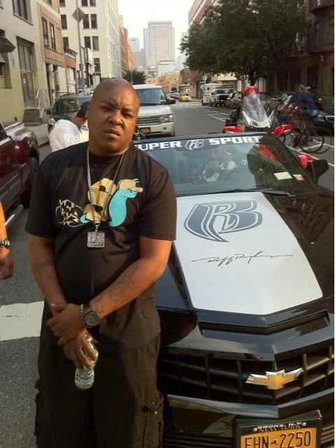
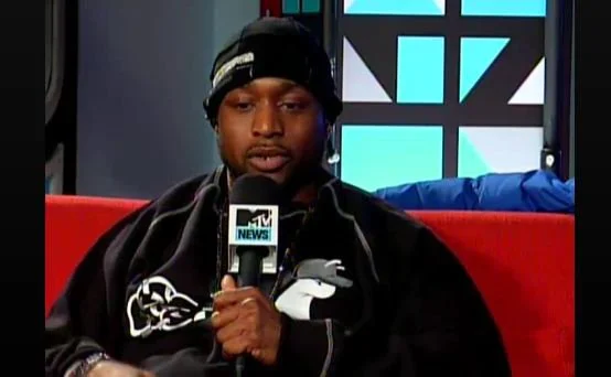
In 2009, I lived across the street from Bucks. He and his partner had a clothing brand with a logo they couldn't stand — a clock with a dollar sign. Every designer they'd worked with heard "Slowbucks" and drew exactly what it sounds like.
I sat down with him and listened first. Asked where the brand came from, where it was going, and who it was for. The audience part was easy — I grew up in hip-hop culture, no research required.
Design Decisions
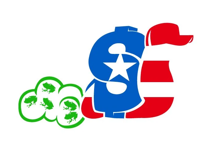
The first decision was how literal to go. I decided early that the mark had to be a symbol: something that would occupy space on a shirt, read from a distance, and hold up across colorways. In 2009 streetwear was running a lot of color variants tied to upcoming sneaker releases, and a brand with real legs had to move with that.
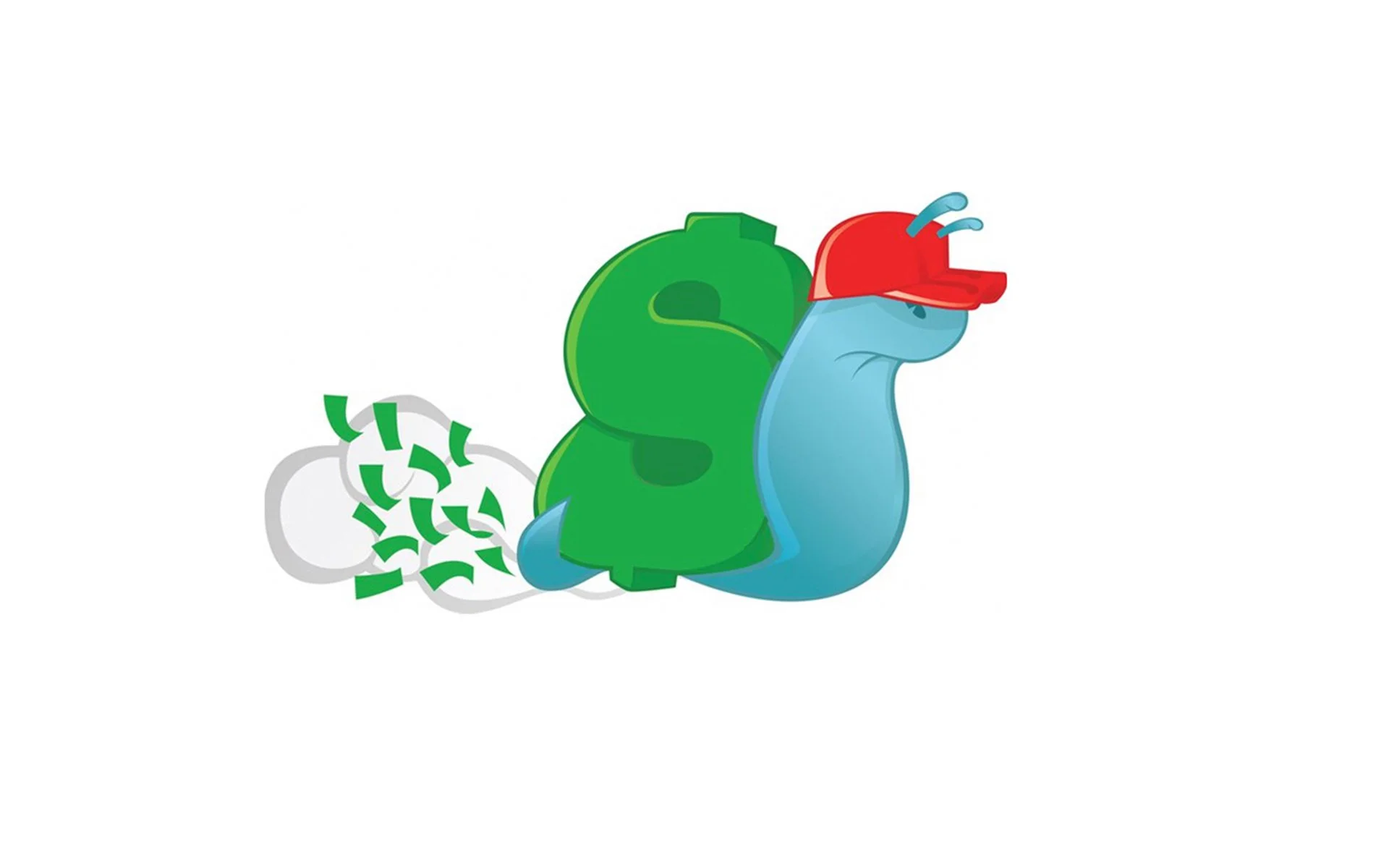
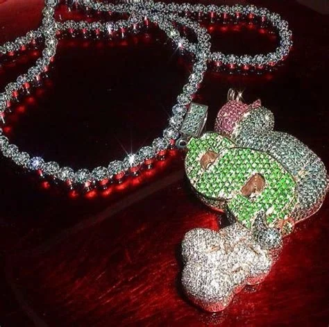
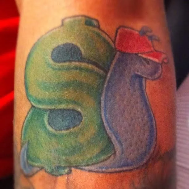
Three animals came through before the snail landed — a piggy bank, a turtle, then the snail. I wanted the letters to live inside the animal itself, the name embedded in the figure. The snail shell gave me the geometry: the shell became a dollar sign, the snail covered "slow," and the dollars trailing behind it covered "bucks."
Those trailing dollars came from a 7-Eleven visit. I went in during a break between design sessions and got stuck behind someone running lotto at the counter. I kept staring at the scratch-off display behind the register to pass the time. The arrangement of the bills on that sign stayed with me. When I needed a solution for what was floating behind the snail, that image came back.
The result was a logo with personality — something that could live on a shirt, a fitted, a sticker, a chain, and be recognized across all of them. Most brands in 2009 put words on a shirt and called it a logo. Slowbucks had a character with built-in personality. It was recognizable, it scaled, and it spoke to the brand name without spelling the story out.
What Happened
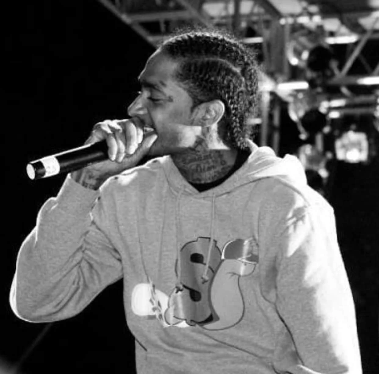
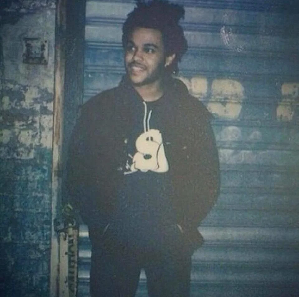
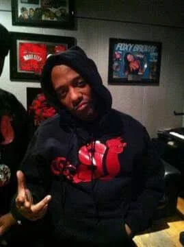
Slowbucks exploded. Snoop Dogg wore it, Rick Ross wore it, Chris Brown wore it. The brand signed a distribution deal with Marc Ecko in 2014. Getty Images has over 180 photos of the brand and its founders. The logo showed up on stages, in music videos, across hip-hop media.
I wasn't just the designer, I was in the trenches early on doing hand-to-hand sales, moving product, building the brand from the street level. In 2012, I met the second partner at a print shop, which led to a rare phone conversation with Nipsey Hussle. That one project had opened doors I didn't know existed.
The brand went through its own chapter after that but the logo never lost its footing. It's still recognized, referenced, searched for. One logo, designed in 2009, generated a distribution deal, 180+ Getty images, coverage across 9 major publications, and is still driving inbound client work 15 years later.
The Lesson
Every designer before me went literal. One conversation changed the direction. I asked the right questions, paid attention to who they actually were, and built something from observation. Listen first. Design second.
Impact
180+ licensed images in the Getty archive — the same index used by the New York Times, ESPN, and Rolling Stone
Worn by Snoop Dogg, Rick Ross, Chris Brown, Nipsey Hussle, The Weeknd
Covered by Complex, Vibe, The Source, HipHopDX, Rap Radar, AllHipHop — 18+ articles across the 2013–2014 cultural moment
Founders featured on The Breakfast Club (Power 105.1)
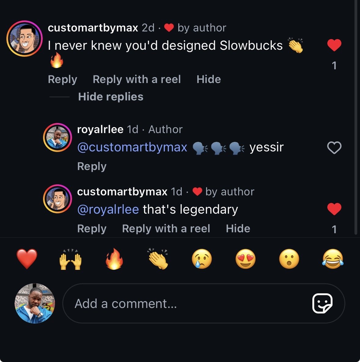
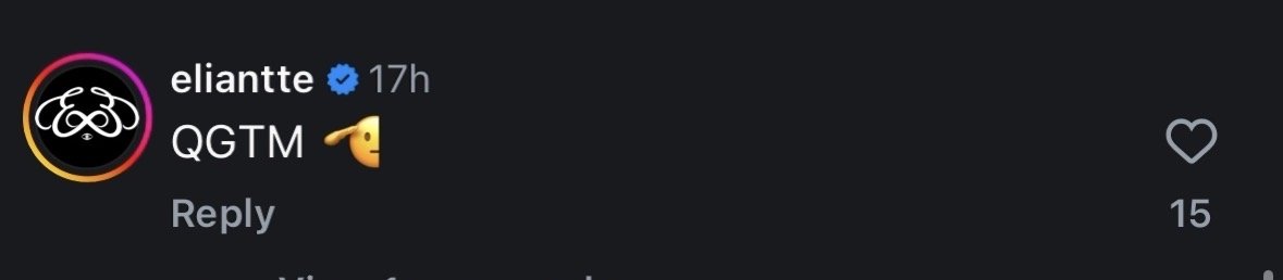
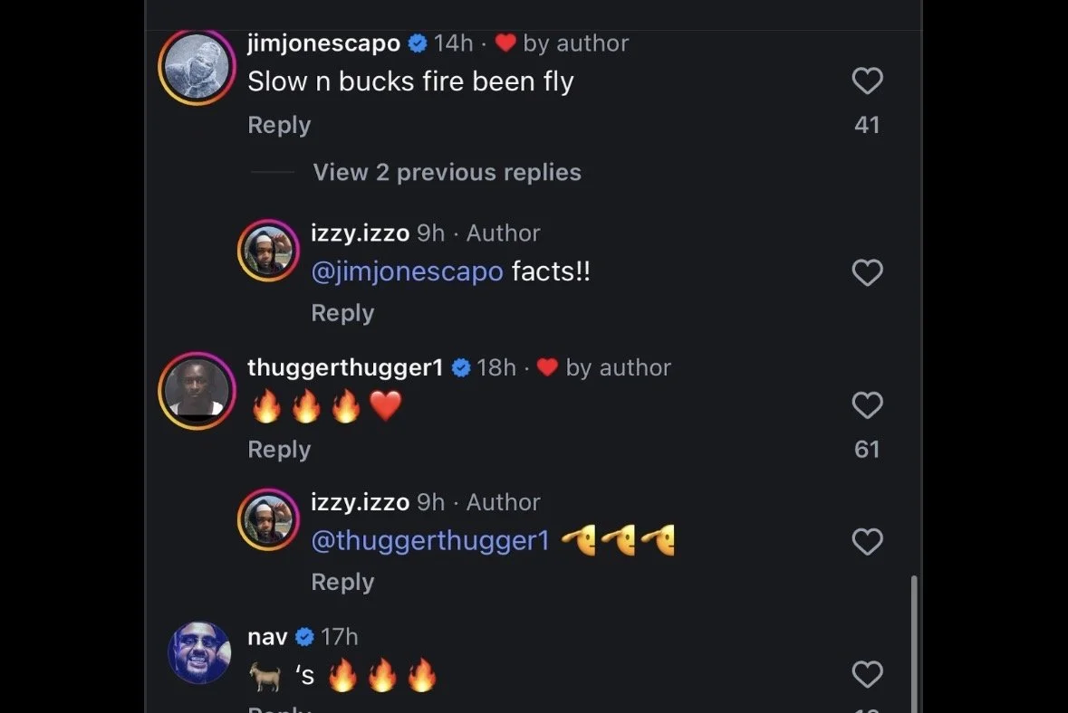
Organic engagement in 2026 from Jim Jones, Young Thug, Fabolous, Quavo, Meek Mill, Rich The Kid, Juelz Santana, Playboi Carti, Eliantte, Nav, and the brand's original founders — 15 years after the logo was designed
If your brand has momentum and an identity that isn't keeping up — that's the exact problem this logo solved. How I work →
2026
Via Instagram 5/12
16.5k likes · 4.7k reshares · 1k+ comments across two posts

Press