Apple Manhasset Mural
Client: Apple Retail; Manhasset, NY
Project: Public-facing mural. Community solidarity and brand expression.
Role: Lead Designer & Creative
Category: Fine Art, Mural, Experiential Design, Public Art, Brand Expression
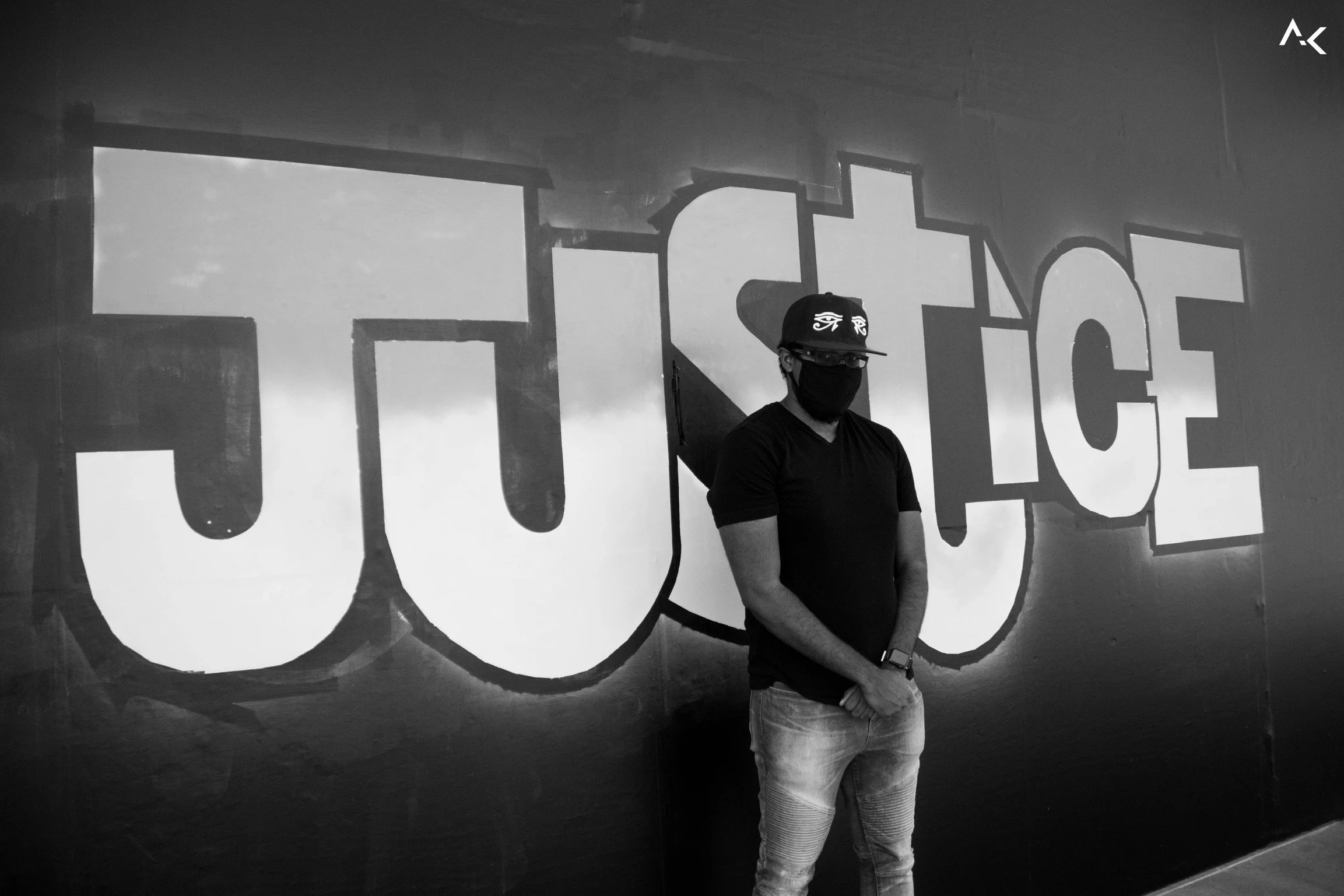
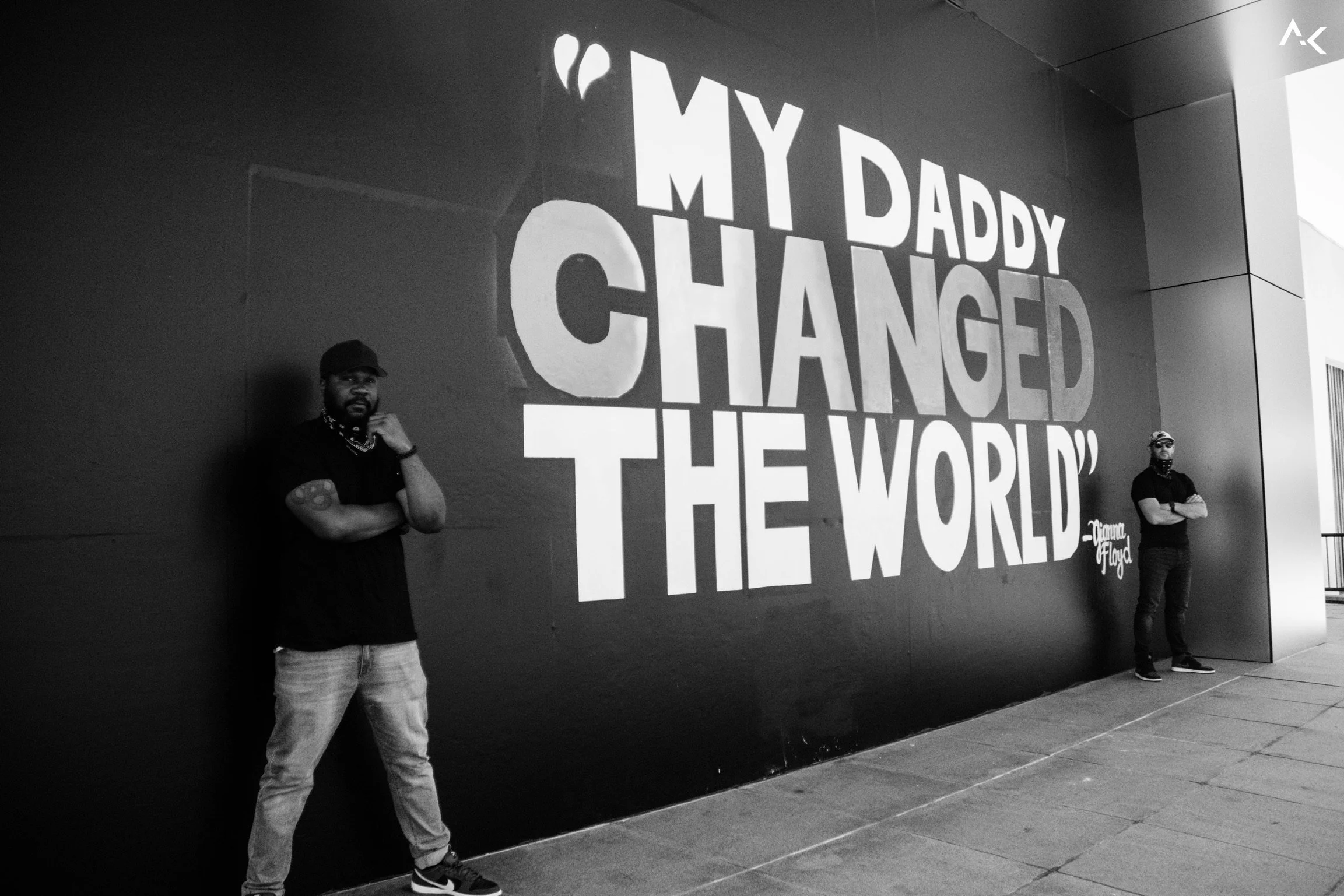
The business problem: Apple stores were boarded up during the peak of both COVID and the George Floyd protests. The building needed to say something. Corporate couldn't say it. The people inside could.
The Story
It was 2020. Protests were happening across the country. COVID was still at its peak. Apple stores were boarded up, most of the workforce was either remote or gathering in small groups just to be together.
Two of my frequent collaborators and I had a group chat going. We wanted to create something — a response that felt real, not institutional. Something from the people who actually worked in the building.
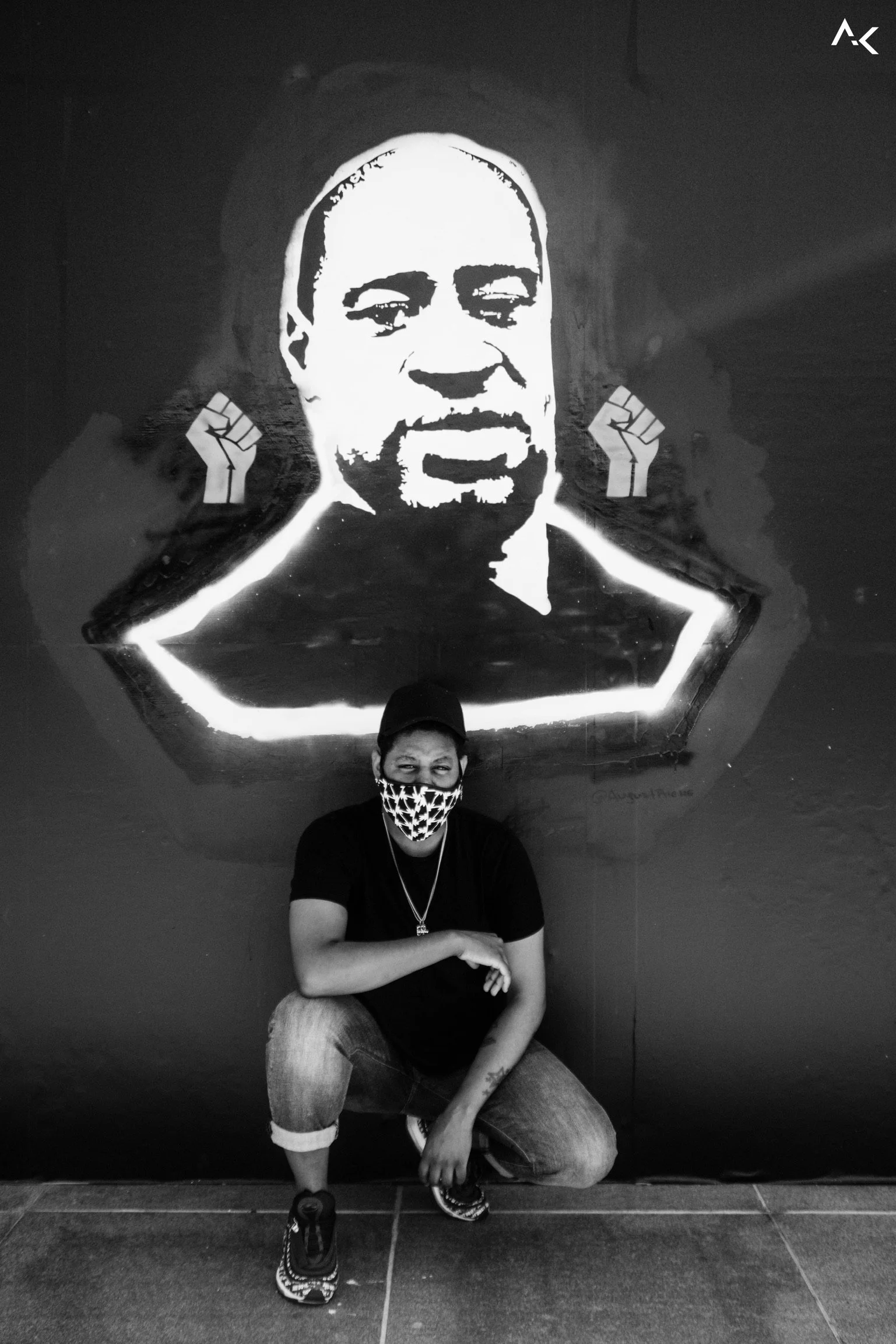
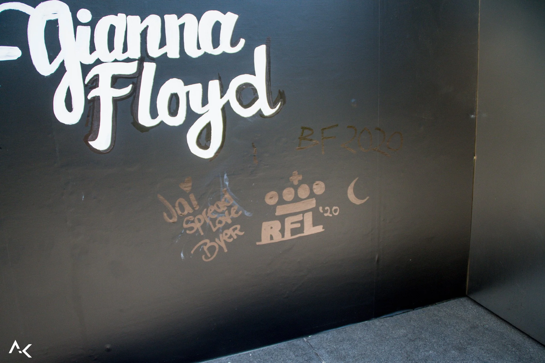
I came up with the design. We used Gianna Floyd's words as the anchor. The visual statement reflected Apple's values with clarity and empathy without feeling performative.
The concept was presented to the Market Director and Market Leader and approved. I assembled a team by pulling equally talented Apple employees from nearby stores. I led the installation from there — coordinating the build, the materials, the execution across two six-hour days.


Design Decisions

The first decision was the letterforms. People viewing the mural are moving. You have maybe three seconds as someone passes in a vehicle to make an impact. Script would spend those three seconds creating confusion, not impact.
The letters needed to be legible and immediate. I have a graffiti background, but I also know that not everyone on a production team shares that foundation equally — and this wasn't the project to navigate around that. I went back to typography. Forms I could control and hand off with precision.
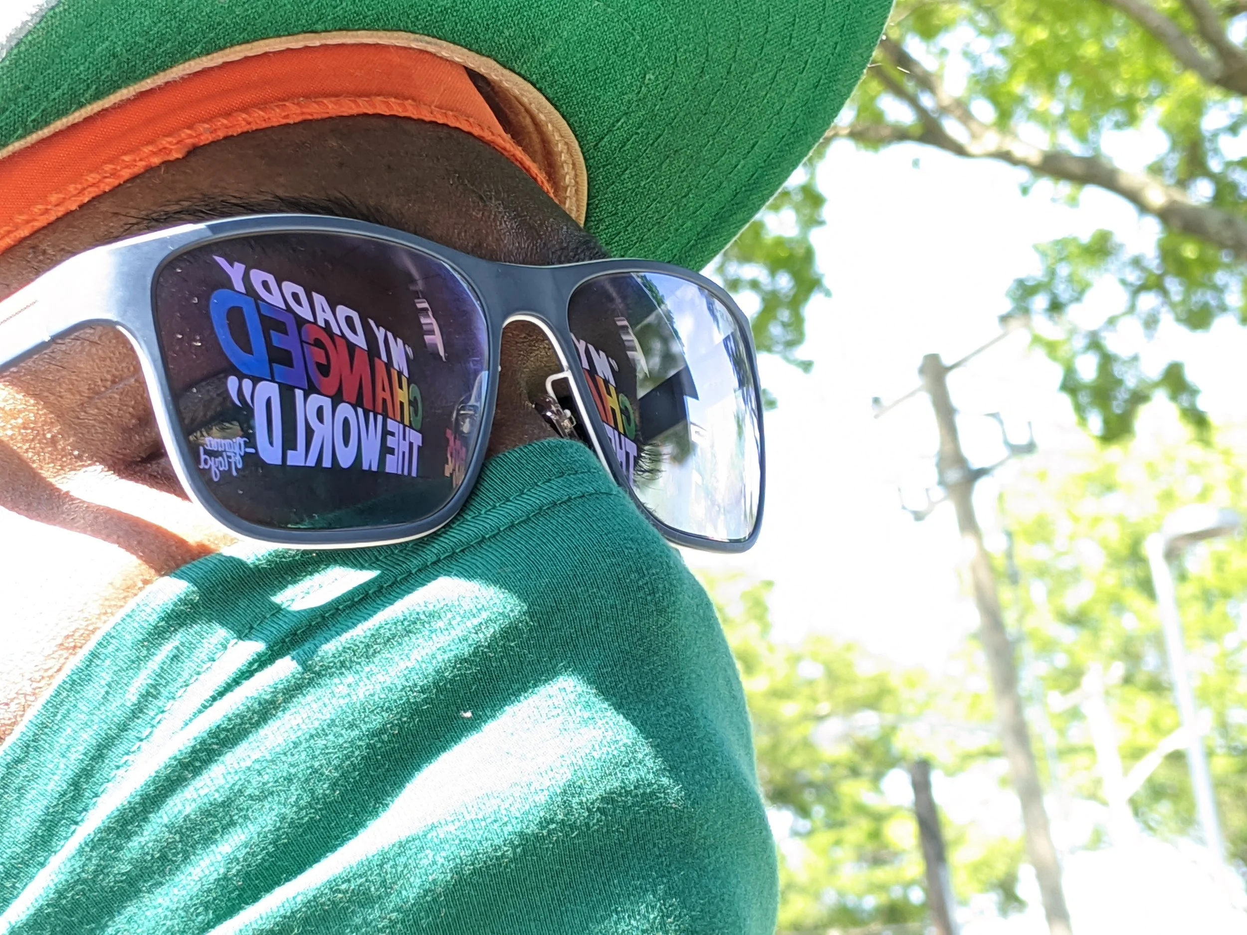
What most people won't notice: the gradient sequence matches the exact color order of the original Apple logo. It was a nod to the company that approved the work, built into the visual without announcing itself. The gradient isn't decorative. It represents the community of employees inside that building — not the divisions, not the lines that separate people, but the blend.

Gianna Floyd's words were the anchor for the whole concept. Her father's life was the subject of much discussion, protest and emotion. But her quote is what centered this design. That's the part that made it human rather than institutional or politically driven.
What Happened
The mural became a visible symbol of solidarity for the local community. It received support and amplification from Apple's VP of Environment, Policy & Social Initiatives.
The project led directly to additional commissioned mural work, including a 105-by-50-foot installation at Chelsea Piers Fitness in Downtown Brooklyn.

The Lesson
This project didn't start with a brief. It started with a group chat and a gut feeling that something needed to be said. What made it work was the willingness to initiate, the judgment to keep the message honest, and the ability to lead a cross-store team through a build that had to be right the first time.
Impact
Public-facing mural at Apple Retail, Manhasset, NY (front and back facing)
Amplification from Apple's VP of Environment, Policy & Social Initiatives
Led directly to Chelsea Piers Fitness mural commission (35' × 20', Brooklyn, NY)
Cross-store team assembled and led across two build days
Completed in six-hour windows using hand-applied materials
Special Thank you to: Jai, Brandon & Christina, Steven, Ariana, Ashley, August, Brian, Kamarah, Court, Ajon, Adam and everyone who helped install the mural.