Legacy Strength Gym — Brand Identity System
Client: Legacy Strength (fitness gym, Long Island, NY)
Project: Logo refresh, brand identity evolution, mascot system
Role: Creative Director
The business problem: A gym that had outgrown its identity but couldn't afford to lose what made the name stop strangers.

The Story
Legacy Strength already had a great logo. The original was credited with work on major brands. It held up. The problem wasn't the mark — the gym had outgrown it.
The owner knew his business precisely: follower count, active newsletter, real copywriting knowledge. He could articulate what was working and what wasn't, which made it easy to find where I could help. Three things surfaced in discovery.
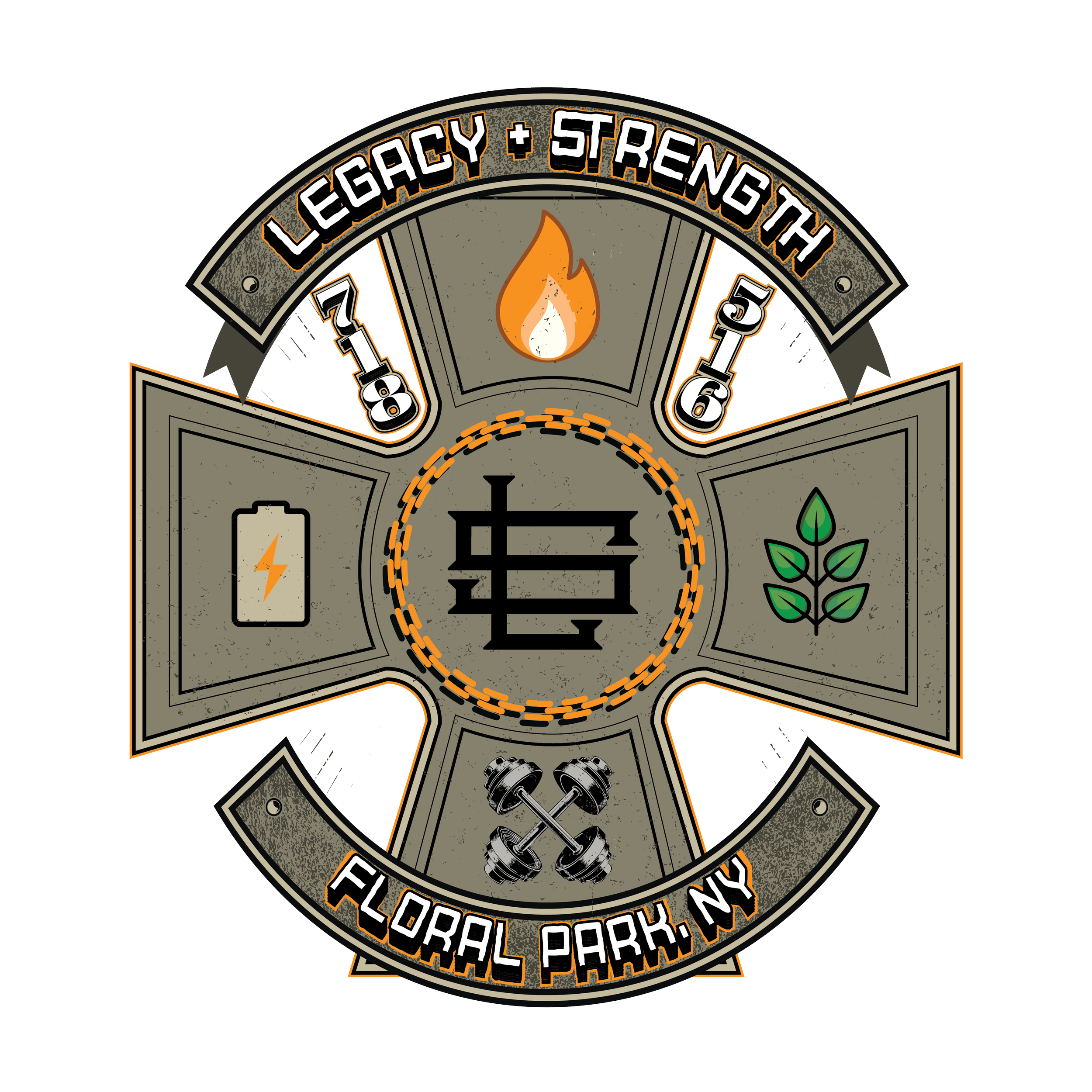
The word mark was the most valuable asset. "Legacy" and "Strength" together stop people — strangers who'd never heard of the gym would see the name and ask about it. Any new design had to keep those words front and center.
The military aesthetic had always been the intention but never fully landed. The gym's culture was military-coded — its clients, its energy, its identity. The orange and gray palette was strong. But a military expression that could live on tactical apparel, limited-color prints, and powerlifting gear didn't exist yet. That was the gap.
The mascot had a real origin story. The gym grew out of a competitive powerlifting team. A line from a Run the Jewels track became a rallying phrase. Someone designed a baby bear for team shirts. It stuck — but the owner always felt it was too soft. The natural evolution: the baby bear grew up. That progression from raw beginner to something earned and powerful was the gym's actual story.

Design Decisions
Logo redesigns usually arrive carrying someone else's disappointment. The client comes in with buyers remorse from a previous designer, and the room isn't neutral before you start.
This one was different. The client communicates well, knows his brand, and came in without that weight. So the first decision wasn't a design decision — it was a curation decision. What stays, and what goes.
I kept the colors. I kept the plus sign. Everything else was reconsidered, and eventually the plus sign went inside the S. What drove every choice was restraint: you don't tear a legacy down to rebuild it. You find what's load-bearing and build around that.
There were directions that didn't make it. The owner does yoga, and I explored some of that geometry — looser forms, more contemplative marks. He rejected it, and was right to. It didn't match the grit of what Legacy Strength actually is. Good feedback from a client who knows his brand is something to move with, not push against.
What Happened
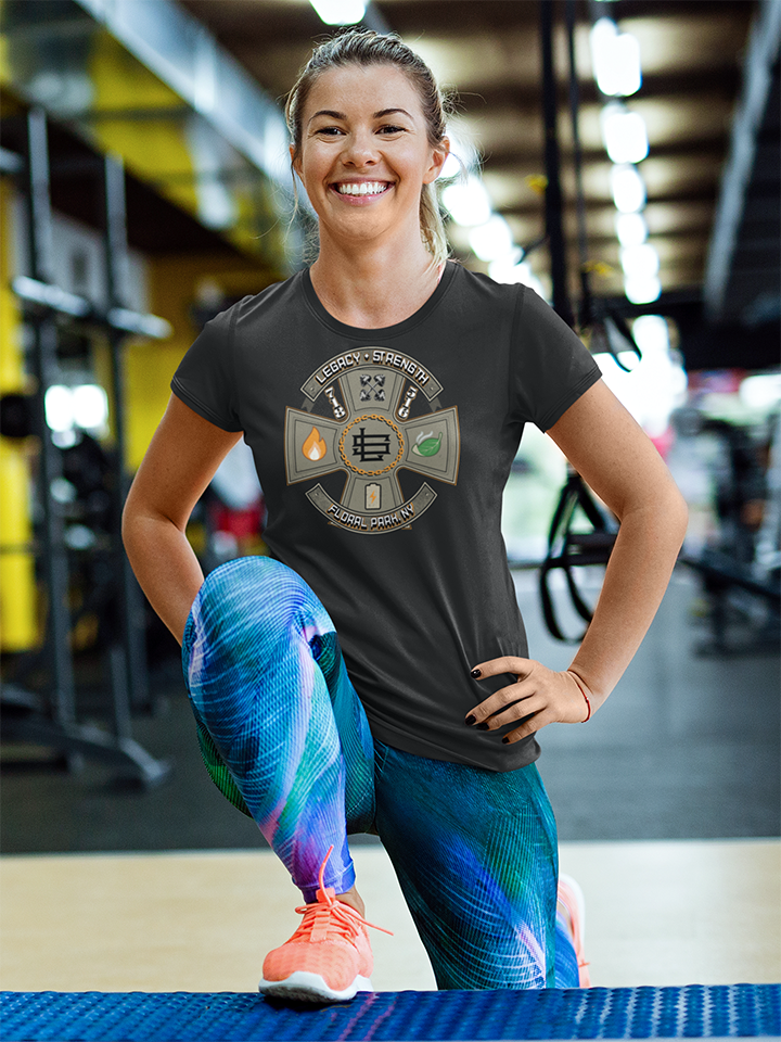
The identity system included a military merch aesthetic that finally matched the gym's culture — word mark intact, plus sign repositioned, mascot evolved from baby bear to adult bear. The system now operates across tactical apparel, limited-color prints, and powerlifting gear without losing coherence.

The Lesson
Knowing what not to change is as important as knowing what to add. The word mark's power, the military aesthetic, the mascot's narrative — all existed before I touched anything. My job was to give them form.
If you've outgrown your identity but you're afraid of losing what works — that's what an audit is for. How I work →